
Playing Roulette on Mobile: UI Features That Actually Help
Roulette on mobile requires specific UI decisions: where to place the bet buttons, how large to make the numbers, how to display the paytable. The best mobile casinos treat these decisions as essential design, not afterthoughts.
Jump to a section
A casino architect would approach roulette on mobile by asking: what information does the player need simultaneously. In a traditional roulette table, a player sees the full wheel, the betting layout, and the past results. On a five-inch screen, none of these fit simultaneously.
The optimal mobile roulette interface uses a carousel design. The main view shows the wheel. Swiping left reveals the betting layout. Swiping right reveals results. This allows players to access all information without overwhelming the screen.
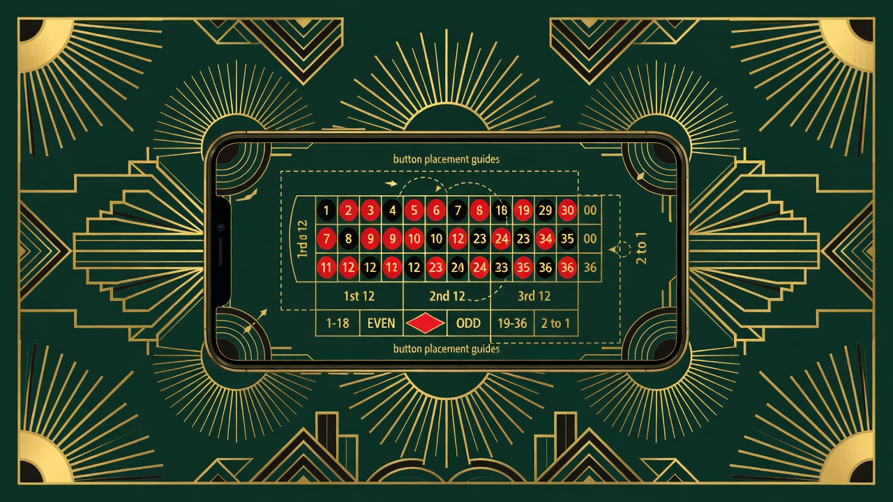
Bet buttons should be large enough for thumb interaction. Minimum twenty-four pixels. The traditional betting grid is too small for fingers. Top casinos enlarge the grid or simplify it.
Numbers on the roulette wheel should be readable at the current zoom level. A five-pixel number is unreadable. Best practice: text size scales with viewport width, not fixed pixel size.
The past results display should show clearly. The last five to ten results matter. Displaying the last thirty results uses too much screen space. A horizontal scrollable list of past results works better than a vertical column.
The Timer
Roulette has a natural timer: the ball spins, the results are announced, betting opens again. On mobile, this timer needs to be prominently displayed. A large countdown: "Bets close in 45 seconds."
The Goldfinch mobile roulette interface displays a large countdown in the center of the betting area. Players cannot miss the time pressure. This prevents accidental closed bets.
The Payout Display
Roulette has thirty-seven potential outcomes. Displaying payouts for all thirty-seven is impractical on mobile. The best interfaces show payouts contextually.
When a player hovers over a number, the payout appears. When a player taps a number, the number is selected and the bet amount appears. This reduces screen clutter while maintaining payout transparency.
Color and Contrast
Roulette wheels are red, black, and green. On mobile screens, the color contrast must be high. Red on black is traditional but low contrast. Best mobile roulette uses lighter reds and blacks or adds white borders around numbers.
Green zero is often displayed as brighter green to distinguish from red and black numbers.
The Bet Placement Experience
Traditional roulette: place chips directly on the layout. Mobile roulette cannot use click-and-place because the layout is too small. Instead, most casinos use a betting controls system.
The player selects a number, then adjusts the bet amount with plus-minus buttons or a slider. This is slower than click-and-place but more accurate on mobile.
Advanced casinos allow shortcut buttons: "Quick Bet." The player's last bet is remembered and placed again with a single tap. This speeds up the mobile experience significantly.
Animation Considerations
Mobile devices have limited processing power. The spinning wheel animation must be optimized. Best casinos use lower resolution animations on lower-end devices.
The ball should animate realistically. It should appear to slow down as it approaches the winning pocket. This gives the animation a feeling of causality, even though the outcome was predetermined.
The Results Display
After the ball lands, the result is announced. Large text: the winning number. The payout for that number. Win or lose for the player.
Winning results display in green. Losing results display in red. This color feedback is instantaneous and requires no reading.
The Overall Principle
Mobile roulette faces a fundamental constraint: small screen. The best interfaces embrace this constraint rather than fight it.
They simplify the interface. They enlarge text. They use carousels and swipes instead of scrolling. They display information contextually instead of all at once. They use color and timing to provide feedback.
The casino architect's job is to display all necessary information in the correct priority. The wheel is primary. The betting layout is secondary. Past results are tertiary. The interface should reflect that hierarchy.
Most casinos get this wrong. They squash the desktop interface onto mobile. The result is unusable. The best casinos redesign specifically for mobile, treating it as a distinct medium.
Pass it on
Choosing where to play? The casino ratings score each site on 6 checks, in half stars.
See the ratings